ONE LINE BRIFE
Challenge
Create a final project based on the one-line bride I received from my art director “There should be an animated fact-checker alert when people share the wrong information on social media.”
Research
Ux UI
Before this project, I had never worked on a Ux Ui design. So after receiving my short brief, I started researching the differences and important principles of Ux Ui design.
Contextual Awareness: One of the principles I learned about was to Consider the context in which users will interact with the product, including their environment and devices.
Affordances: Design elements that should suggest their usage, clarifying how they should be interacted with.
Feedback: Provide users with clear, immediate feedback for their actions, confirming success or indicating errors.
Misinformation
Along with Ux Ui design I look to the best ways to prevent and inform people about the spread of misinformation.
My biggest takeaway from this research was
Create a safe space. Do just tell someone they're wrong if form them and then give them the tool they need. This will make them more open and receptive to the factually correct information.
Promote Transparency, Have the source of the information right there.
CONCEPTS
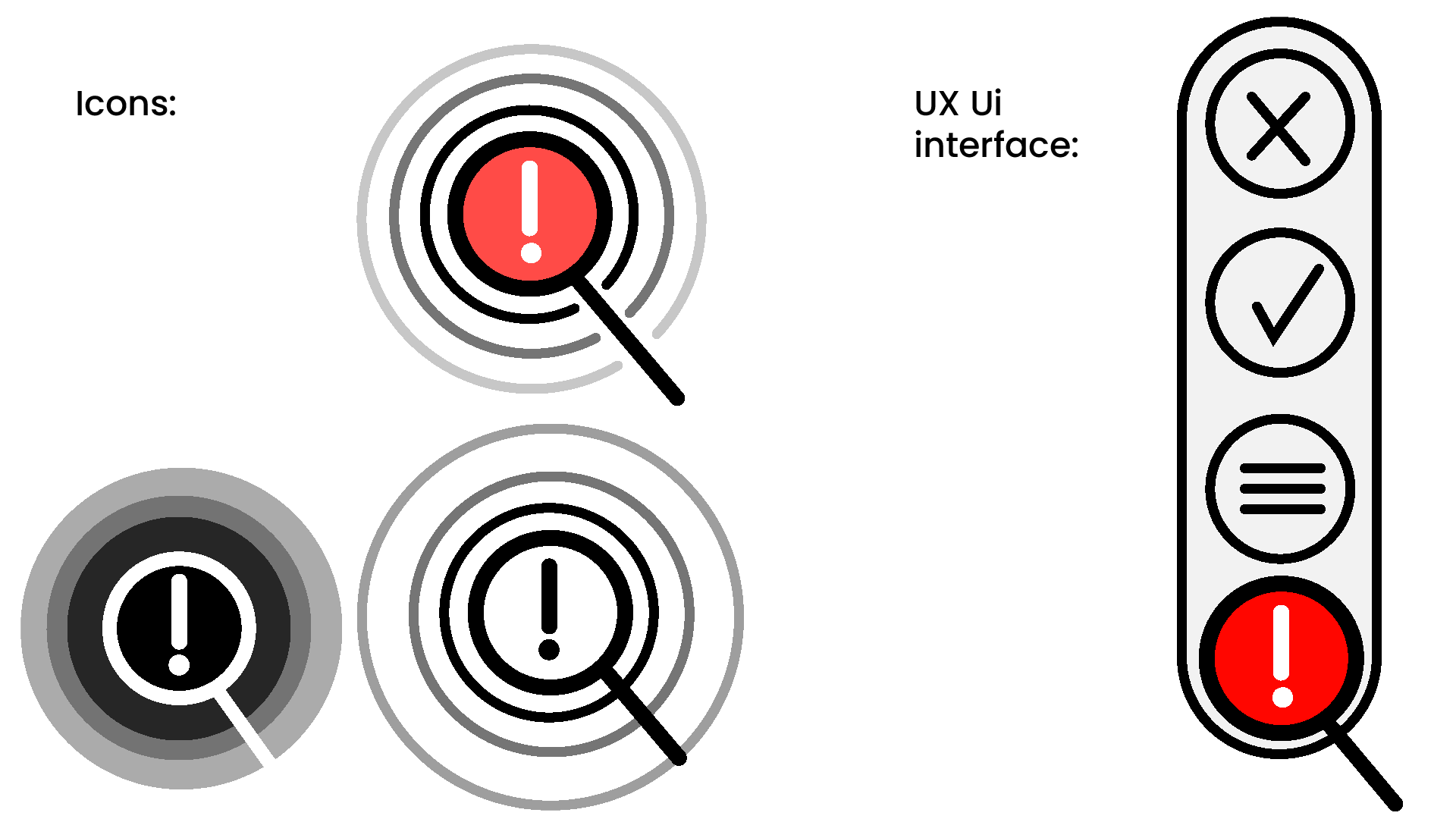
Many Ui Ux designers already use a simple but bold design. By using this popular and timeless style the icon and animation will be able to complement any social media it is used on in the future.
While looking into the bigger tech companies I saw many of them were using gradients and rounded shapes.
Direction 01 :Bold and Classic
Direction 02 :Gradient
DESIGN REFINEMENT
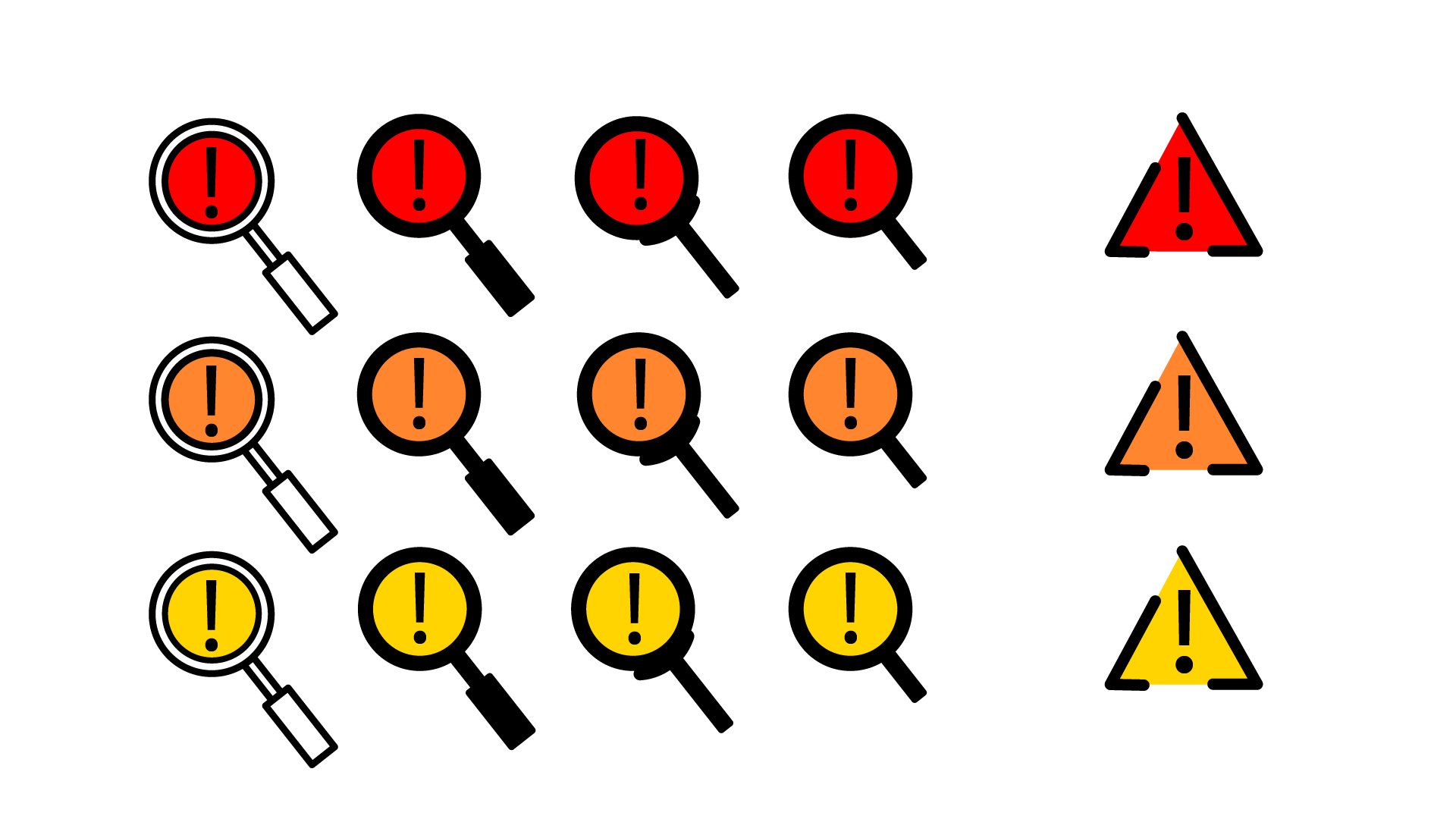
After my art director chose an art style I created more iterations of my original magnifying glass icon. but through the process, I landed on an entirely new icon. Ultimately, I chose the cation sign over the magnifying glass because it quickly grabbed the users’ attention and told them something was wrong.
ANIMATION DEVELOPMENT
Motion Test
The challenge of creating an eye chatting, short, expressive animation was exciting and might have been one of my favorite parts of this animation process.
Animation Pass 1
Animation Pass 2
Refining animation to ensure users will have a comprehensive experience.
Composit Breakdown
I was advised by my art director to combine the elements from Animation 2 and 3 to create a the main animation
I created my mock-up to achieve the best look at how this animation would work on a phone. With the assistance of my teacher, we used a RED Digital Cinema KOMODO 6K camera to film myself holding the phone with a green screen, which was later in NUKE with the screen animation.
Final Deliverables
Icon Animation
Screen
Compositing


